
Friday, November 4, 2011
Friday, October 28, 2011

Website!
NOt Finished because i missed two days and I am behing and it would not let me save for web & devices.
Monday, October 24, 2011

Friday, October 21, 2011
Creative Process
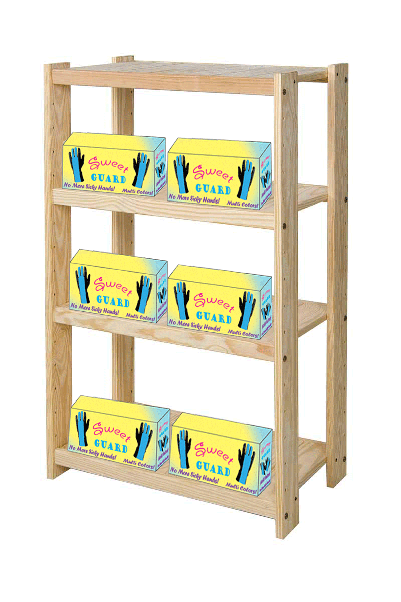
I made this box with the same logo that I have also created. The box is designed big enough to fit one pair of gloves. I have also made it where the gloves come in different type of colors: blue, purple, pink, yellow, green, black, and white. I kept the colors in the logo blue, pink and purple because it looked good and makes it stand some. Then I made the box, itself, a light shade of yellow with a little bit of blue around to make the logo pop out. I also added that the gloves came in multiple colors. Then I added the phrase “No More Sticky Hands!” because when you wear the gloves wile eating ice cream, it won’t drip or run onto your hand and make them sticky. In the logo I made the word “Sweet” kind of arched to give some pop to it. Finally, I put the box on a random shelf to show how it would look on one.
Wednesday, September 14, 2011
Sweet Guard

Creative Process
I chose the company Sweet Guard. In the logo I created, I chose three different colors: pink, blue, and a purple outline. I chose these colors because they pop-out in a way that can catch someone’s attention easy. In the phrase “Sweet Guard” I used the font type Giddyup Std on the word “Sweet” which makes the ends of the letter curl up. I also used a purple outline and pink filling. On the word “Guard” I used the font Goudy Stout which makes the letters look bold and ready to protect. But on the “d” I created it myself and made it look like ice cream. I also used a purple outline and blue filling. The client wanted the word “Sweet Guard” to be designed in a unique and eye-catching way, a maximum of three colors, a vector image of only the company name, and musts consist of only the company name. I have created this logo by following these rules. I created the logo in a unique and eye-catching way. I have used only three colors which again are pink, blue, and purple. The logo is a vector image and can be used on anything from a billboard to a card. I also didn’t use any shapes or images in the background or underneath to create it. This logo consists of the logo “Sweet Guard” and nothing else, just made in a different and unique way.

Subscribe to:
Comments (Atom)